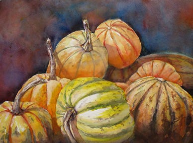
Part 2: Rule Of Thirds, Why Is It Necessary?
Obvious question.. Does an artist need to compose a piece? Here let me relay an analogy of a house being built. Although the contractors will be the ones building the house, the owner will definitely have an input regarding the number, locations and the lay of various rooms.
Mar 28, 2018
All good art has to be designed and composed well. Which takes quite a while, loads of patience and several thumbnail iterations before embarking on splashing the paint on to the canvas.


Part 4: The Tyranny Of The Rule Of Thirds
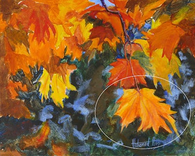
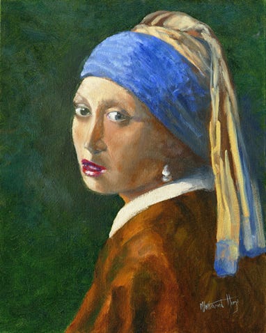
As I discussed on the last posts, placing the area of interest in the centre of the painting is boring and hence the rule of thirds was devised to encourage the artists to place the focal point off centre. However not all images lend themselves to fit this mould.
Apr 5, 2018

Apr 10, 2018
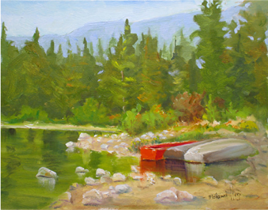
Quiet Area
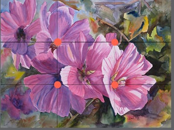
To prevent the painting from getting too busy, the artist usually places a quiet area in the painting typically around the focal spot. This provides a rest to the eyes, especially when it is placed next to the busy focal spot. This quiet area is designed such that