In my previous communication, I discussed the concept of value contrast in attracting the viewer's eyes to the focal spot. Another strategy employed by the artist to accomplish the same purpose is the use of colour contrast.
The colour contrast concept may be used in one of several ways. Some of the method used are as follows:
3) A unique colour which has not been used elsewhere in the painting at least not at that intensity: The acrylic painting called the Gems Of Hawrelak Park is another case in point. Our eyes seem to gravitate to the vivid, brightly coloured red bush. Apart from an occasional echo of similar colour within the reflection which is used leads the eyes to the focal point and an occasional spot here and there, this vivid colour is nowhere to be found. Several others colours like the dark and light greens, the browns and the mauves as well as the yellows and oranges are in abundance.
4) Warm colours surrounding cool colours: This is another of the techniques to guide the viewer to look at what the artist desires. Here on the following watercolour painting "For Mom" the centre of interest is in the centre of the rose on the bottom right. The red and the brighter red-orange which are the warmer colours are surrounded by the cooler blue colours and the dull brown colours.
Feel free to ask any questions that may arise. If you like this, please forward this to your family and friends and contacts on the social media.
Mohamed Hirji
Blog Post
1) Using saturated or vibrant colours against a background of muted, less saturated or dull colours belonging to the same family of colours: In the example below of Fall Reflections, an oil painting, the rust-coloured bush is the centre of attraction. The colors of the bush belong to the same family of colours of the surrounding trees and other foliage namely the oranges but the colour of the bush, however, is more vibrant than the dull muted colors of the surrounding foliage, except a fews small marks that echo the colours of the bright bush.
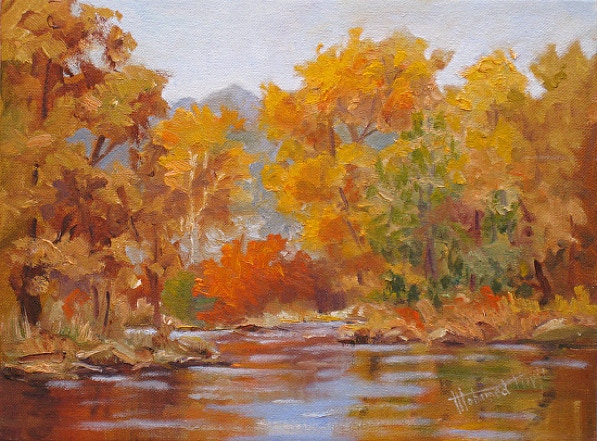
Fall Reflections, Oil Painting
2) A colour surrounded by its complementary or near complementary colour. e.g red against green or orange against blue, yellow against purple etc.: The watercolour painting titled Scarlet is the case in point. The bright purplish-red bush contrasts against the yellow-green background, which is the complementary colour.
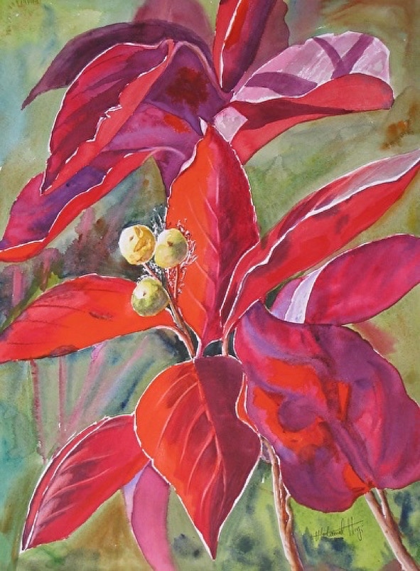
Scarlet, Watercolour Painting
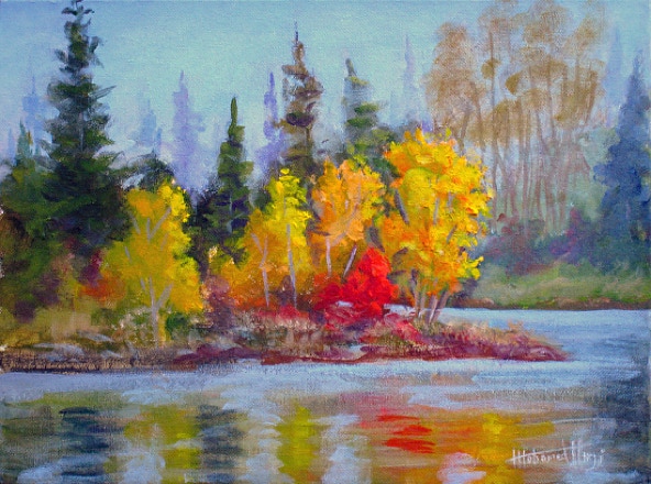
Gems Of Hawrelak Park, Acrylic Painting.
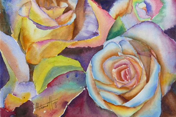
For Mom, Watercolour Painting.
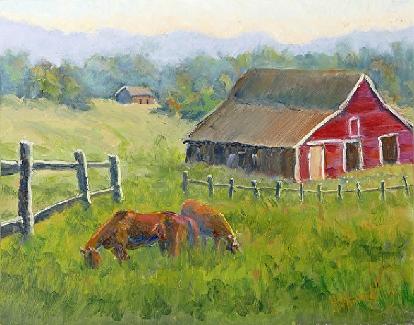
5) One may also encounter the artist using more than one of the above strategies as in the oil painting below, titled Ranch On The Cowboy Trail, demonstrates a combination of several of above. In this painting, Ranch On The Cowboy Trail, the centre of attraction is the stable. The red colour of the face of the stable contrasts with the complementary colour of the green grass. Also, the red colour is the unique colour, not utilized elsewhere and it is surrounded by a rather dull brown colour. As I had discussed in my last blog, the principle of value contrast also plays a role here as the dark doorways of the stable are surrounded by a white trim.