Jun 9, 2018
One of the cornerstone of a painting is a shape. A shape is any object which has two dimensions e.g. a height or length and width. There is
also a negative shape that surrounds the object but we will discuss that another time.
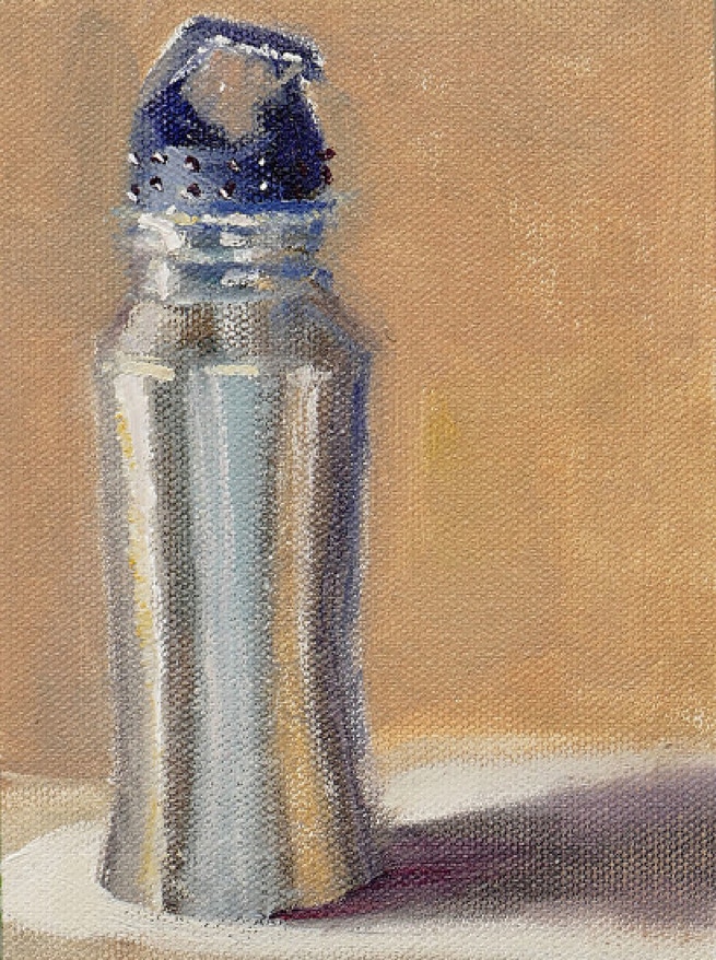
Let us take a simple example of my painting of the water bottle. Here the silver steel water bottle is the positive shape. The shadow on the table is also a shape. The brown background is also a shape, however since it does not represent an object, it is termed a negative shape.

The Water Bottle, Oil Painting
Since the purpose of art is to entertain the viewer as long as possible, the artists must make sure that the shapes they create on the canvas are interesting. The more interesting the shape, the better the painting. Therefore it stands to reasons that one must avoid boring shapes at all cost.
So what is a boring shape? In short any shape in which all the dimensions or some of the dimensions are the same. This happens mainly in man made objects, but it is also abundant in nature, but since nature is so vast we tend not to notice this relative minutiae. However, since we paint only a tiny portion of nature, a boring shape becomes very obvious. In the painting of the water bottle above, even thought the sides are similar in dimensions, the differences in reflections of the surrounding changes the apparent shape and makes it interesting.
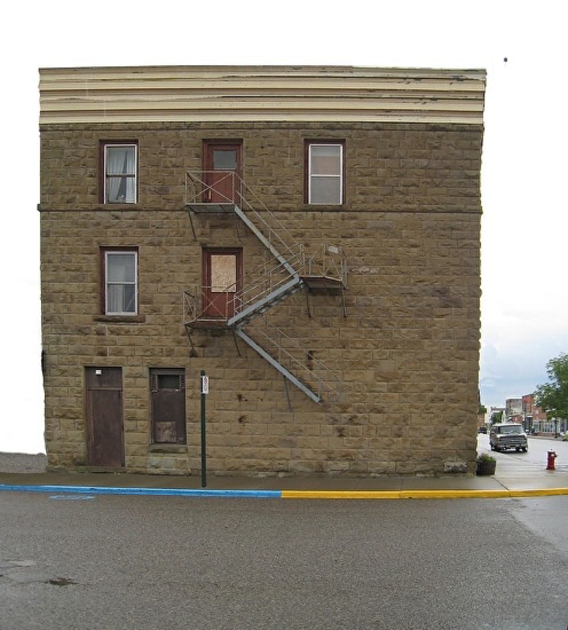
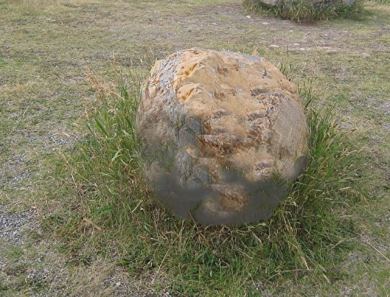
Now let us see some examples of boring shapes
In the picture below, the building is square in shape. Both its dimensions, the length and height are almost the same. not many people will stop by to admire this building.


