Image Credit: https://www.croptrust.org/crop/barley/
Data
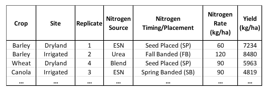
Table 1 depicts a simplified data table of the inputs used in the statistical analyses. Yield (kg/ha) was the response variable. The predictor variables are Nitrogen Source (Urea, Environmentally Smart Nitrogen, or Blend), Nitrogen Timing/Placement (Spring Banded, Fall Banded, or Seed Placed), Nitrogen Rate (0, 30, 60, 90, or 120 kg Nitrogen/ha), and the Site (Dryland or Irrigated). All predictor variables were manipulated, and are categorical. The experimental units are the agronomic plots used to carry out each experimental treatment (ex: Urea - Seed Placed - 120 kg N/ha).
Table 1. A simplified data table portraying the data inputs used in the analyses. Yield data for crops (barley, canola, or wheat), Sites (Dryland or Irrigated), Replicates (1-4), Nitrogen Source (ESN, Urea, or Blend), Nitrogen Timing/Placement (Fall Banded, Spring Banded, or Seed Placed), and Nitrogen Rate (30, 60, 90, or 120) were used in the analyses.
Histograms of the yield distributions for each crop is displayed in Figure 3, with barley, canola, and wheat yields all following normal distributions. Canola displayed lower overall yields, followed by wheat, and then barley (Figure 3).
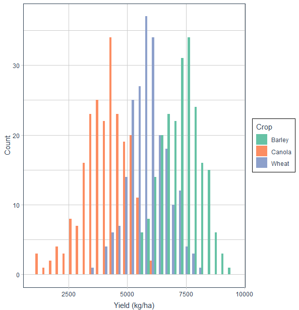
Figure 3. Yield histogram for barley (green), canola (orange) and wheat (blue) in 2008 at the research site in Lethbridge, Alberta.
A boxplot of barley, canola and wheat yields for the dryland and irrigated sites is displayed in Figure 4. Dryland and Irrigated sites have similar yield distributions for each crop.
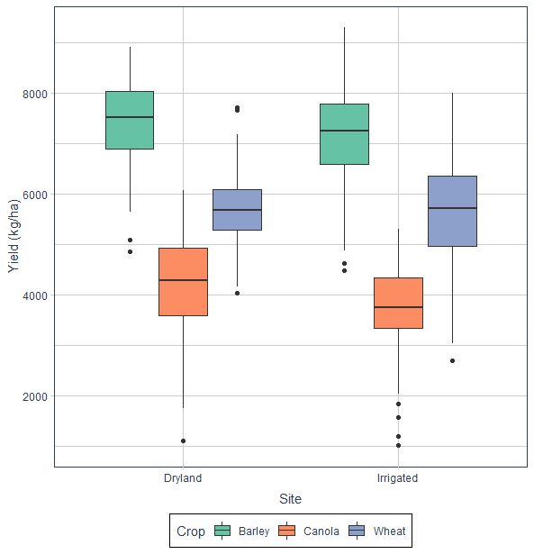
Figure 4. Boxplot of barley (green), canola (orange) and wheat (blue) yields for the dryland and irrigated sites in 2008 at the research site in Lethbridge, Alberta.
Barley, canola, and wheat yields for the nitrogen fertilizer rates are portrayed in Figure 5. Barley and wheat appear to have a greater yield response for each fertilizer rate than canola (Figure 5).
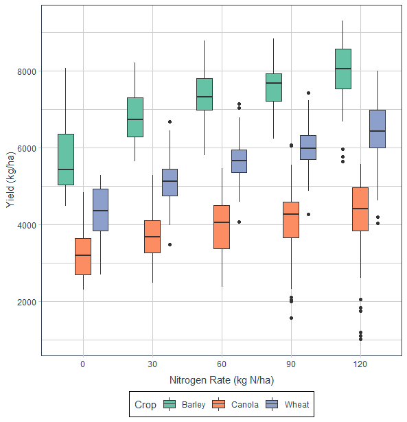
Figure 5. Boxplot of barley (green), canola (orange), and wheat (blue) yields for 0, 30, 60, 90, and 120 kg N/ha fertilizer rates in 2008 at the research site in Lethbridge, Alberta.
A boxplot of barley, canola, and wheat yields for different nitrogen fertilizer sources are displayed in Figure 6. Yield means for each crop are similar for the different fertilizer sources (Figure 6).
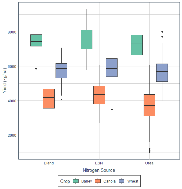
Figure 6. Boxplot of barley (green), canola (orange), and wheat (blue) yields for Blend (25% Urea, 75% ESN), ESN (Environmentally Smart Nitrogen), and Urea nitrogen fertilizer sources in 2008 at the research site in Lethbridge, Alberta.
Barley, canola, and wheat yields for fall banded, spring banded, and seed placed fertilizer applications and timings are portrayed in Figure 7. Seed placed appears to have lower yields for all crops compared to the fall and spring banded fertilizer applications (Figure 7).
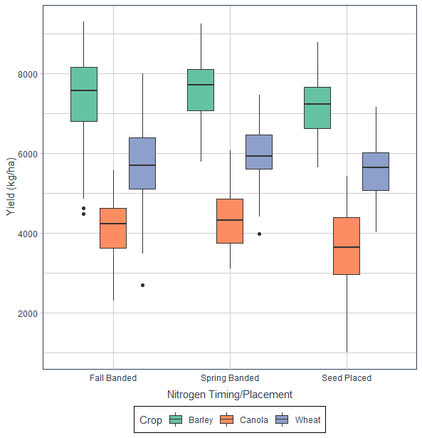
Figure 7. Boxplot of barley (green), canola (orange), and wheat (blue) yields for Fall Banded (FB), Spring Banded (SB), and Seed Placed (SP) nitrogen fertilizer timings and placements in 2008 at the research site in Lethbridge, Alberta.
Data was checked for normality and homogeneity by examining boxplots and residual plots.
Disclaimer: This website is a project for REN R 690 at the University of Alberta, and was developed solely to fulfill the requirements for the course.
