1. What are some characteristics of memory?
2. What are two kinds of external information?
3. What should flight-deck checklists do, and how should they be designed?
4. What is the systems approach?
5. What are four levels of human-machine system interactions?
6. Describe control systems theory.
7. What are the four types of constraints on action?
8. What cues did Kline and Beitel (1994) find that best indicated how to open a door?
9. Explain the four factors that affect the understanding of visual representations and semiotics.
10. What did Mortimer (1993; 1999) conclude was the most important thing about high-mounted brake lights?
11. What are some problems with manuals?
• knowledge is in your ____
• information is in the _____
Tradeoffs between knowledge and information:
• knowledge: you know what to do
![]() no external cues needed
no external cues needed
![]() time/effort is required to gain knowledge (________)
time/effort is required to gain knowledge (________)
![]() memories are ________
memories are ________
• information: you follow instructions
![]() no memory demand
no memory demand
![]() external information may be more difficult to use/understand
external information may be more difficult to use/understand
![]() information may _________ (lost manuals)
information may _________ (lost manuals)
Is this a dichotomy? Is there any other possibility with no cons?
_______ memory: handles relatively short-term (but volatile) storage and processing of memories (Baddeley, 2012)
- duration may be unlimited--as long as memory is actively rehearsed; is prone to ____________
- can hold 4±1 items (Baddeley, 1994; Cowan, 2001)
- codes knowledge phonologically, visually, or semantically
Implications for design (Lee et al., 2017):
• minimize working memory ____: reduce number of things people are required to remember
- avoid designs that have modes, or provide adequate mode feedback
e.g., insert mode cursor is | and overtype mode cursor is _
• provide visual “______”
e.g., automated 411 services that speak a number use phone’s display as well
• provide placeholders for sequential tasks, and minimize distractions/_____________
e.g., bookmarks or breadcrumbs
e.g., compared to rotary phones, touch tone phones allowed faster dialing, reducing risk of interruptions
• exploit ________: strategy that organizes several memory items into a larger whole
- physical chunk size: optimal size is 3-4 numbers or letters per chunk
- meaningful sequences:
e.g., 7, 8, and 0 represent one chunk
- letters superior to numbers:
e.g., 1-800-GET-HELP
- keep numbers separate from letters:
e.g., licence plate of “458 GTS” better than “4G5 8TS”
• minimize _____________
e.g., sound-alike letters confused with each other: B C P T and V
e.g., in 2015, an Airbus A330-300 AirAsia X flight had to return to Melbourne after the pilot entered 01519.8 into the flight management system (15° 19.8' east) instead of 15109.8 (151° 9.8' east)
• avoid unnecessary _____
e.g., 002385 takes up unnecessary memory
• ________ of text and instructions
e.g., poor design: “before doing B, do A first”
e.g., good design: “do A, then do B”
• avoid using negatives, which add to memory load
e.g., “turn power off” is better than “ensure power is not on”
____-____ storage: handles longer-term, more stable memories; potentially unlimited capacity and duration
• ___________ (or explicit) memory: “knowing what”
- episodic memory: specific, “autobiographical” events
- semantic memory: facts, general knowledge
• __________ (or implicit) memory: “know-how”
Implications for design (Lee et al., 2017):
• encourage regular use of knowledge
- memory traces are strengthened by frequency and recency
e.g., practice effects
• ___________
e.g., shift pattern for manual transmission is becoming standardized; same command works in different Windows® programs
• carefully design information to be remembered
- should be meaningful/semantically related to other knowledge
- avoid _________ memory, which makes it difficult to learn, and recover from errors: e.g., all prime ministers, Alt-F4 in Windows®
- use concrete, not abstract words
- distinctiveness reduces interference
- organization/grouping
- avoid jargon
• use memory ____
e.g., fax machine display can prompt user for correct operational sequence; write a list of to-do items
• design to support development of correct ______ ______
e.g., apply Natural Design; instead of just what to do, explain why
• know that memory is not necessarily precise or infallible; is ______________
e.g., Susan B. Anthony US $1 coin fiasco, 1979
- can act as memory aids (“reminders”)
- two types of memory aids:
• ______: don’t forget to remember!
e.g., string on finger
![]() cues remembering
cues remembering
![]() lacks content
lacks content
• _______: content; the information itself
e.g., shopping list
![]() provides content
provides content
![]() does not cue remembering
does not cue remembering
Milestone in the history of flight-deck checklists:
- in October, 1935, the U.S. Army was in the final phase of evaluations of competitors for a new aircraft
- entries were submitted by Boeing, Douglas, and Martin
- even though Boeing had had little success in winning contracts for the U.S. Army Air Corps, its prototype (the Model 299) was the favourite
- in fact, the evaluations (a “fly-off”) were almost seen as a formality
- on the Model 299’s second test flight, the aircraft took off, climbed steeply, stalled, and crashed, injuring three and killing two crew members
- the cause was “_____ _____”: the crew forgot to disengage the gust lock, which keeps the movable control surfaces in place while the aircraft is parked on the ground
- newspapers concluded the Model 299 was “too much plane for one man to fly”
- Boeing lost the contract--but received an order for 12 more aircraft for further testing
- the pilots decided to make sure that nothing would be overlooked again by developing four __________: for takeoff, flight, before landing, and after landing
- the 12 aircraft flew over 1.8 million miles without a serious accident
- the Army accepted the aircraft in 1939, and it was given the designation B-17, the “______ ________”
Related incidents:
![]() Northwest Airlines flight 255
Northwest Airlines flight 255
- MD-82 aircraft crashed after takeoff from Detroit
- flight crew failed to ensure flaps and slats configured for takeoff
- flight crew distracted by weather and runway change
- takeoff warning system had no power (disabled)
![]() Delta Air Lines flight 1141
Delta Air Lines flight 1141
- B-727 aircraft crashed after takeoff from Dallas-Fort Worth
- flight crew failed to ensure flaps and slats configured for takeoff
- flight crew and flight attendants were discussing dating habits (despite FAA “sterile flight deck” regulation)
- takeoff warning horn not operative
![]() flight 5050
flight 5050
- B-737 aircraft crashed on takeoff from LaGuardia
- incorrectly set rudder caused aircraft to pull left, takeoff was aborted, and aircraft entered Bowery Bay
Common causes:
- all crashed 25 months apart
- all avoidable--if __________ had been followed
- “_____ _____” involved in 60-80% of air incidents
 US Federal Aviation Regulation Sec. 121.315:
(a) Every airline must have a _________ for each type of aircraft.
(b) All items necessary for starting engines, takeoff, landing, and emergencies must be checked.
“The procedures must be designed so that a flight crewmember will not need to rely upon his ______ for items to be checked.”
(c) Checklist procedure “must be readily ______” on the flight deck, and must be followed.
- but--no data on how to ______ a checklist!
Checklists intended to:
• ensure aircraft properly __________ (using standardized procedures)
• for psychological reasons: team building, facilitate communication
• should not be considered a ________
Checklist procedure:
• _________-________: pilot A calls each checklist item from printed list, both pilots verify that item is set properly, pilot B called verified status
• most common method; applies redundancy
Fundamental question: items
• check __________ (engineering POV)
• check only critical systems (human factors POV)
• tradeoff: flight deck computers (“_____ cockpit”):
- automated monitoring of flight status
- often have 6 displays: 2 in front of each pilot (flight information), and 2 in centre console (engine, systems data)
- pros & cons:
![]() increased safety: ASRS (Aviation Safety Reporting System) analysis showed crews in glass cockpits detected more altitude deviations (vs. ATC detected more in non-glass cockpit aircraft; Degani, Chappell, & Hayes, 1991)
increased safety: ASRS (Aviation Safety Reporting System) analysis showed crews in glass cockpits detected more altitude deviations (vs. ATC detected more in non-glass cockpit aircraft; Degani, Chappell, & Hayes, 1991)
![]() reduced ________
reduced ________
![]() increased reliability
increased reliability
![]() faster checklist; fewer chances for distractions
faster checklist; fewer chances for distractions
![]() better information transfer (communication among crewmembers)
better information transfer (communication among crewmembers)
![]() less “checklist fatigue”
less “checklist fatigue”
![]() poor displays can lead to mode errors
poor displays can lead to mode errors
![]() computers can ___________ (NW 255, DAL 1141: takeoff warning systems failed)
computers can ___________ (NW 255, DAL 1141: takeoff warning systems failed)
Degani & Wiener (1993):
Methods:
- field study: observe flight crews in operation
- interviews with flight crews
- reviewed incident/crash reports implicating checklists (NTSB, ICAO, ASRS databases)
Observations:
1. __________
- no formal signal to begin
- captain decides when to initiate checklist, must remember if previous checklists were completed
- may be affected by ________, stress
2. _____ & Responses
- checklist cards ignored in favour of ______
- instruments not actually checked
- cross-checking not always done
3. __________
- not all airlines require final item “Is checklist complete?”
Checklist performance factors:
• __________: misreading of controls, or of checklist itself
- Degani (1992): 19 recommendations including typeface, font size, colours, spacing, glare, print quality, age of pilot
• social factors: Cockpit (or ____) Resource Management (CRM)
- captain must give time for crew to perform duties
- crew may have to challenge captain to do/finish checklist
• interruptions/____________:
- can preclude cross-checking
- maintenance crews may change configuration; not reset
• ambiguity
- some checklist items only require response of “set”--is control really verified?
Checklist design issues:
1. ______ checklist → greater chance of overlooking an item
• subdivide long checklist into _______ ones
e.g., split B-727 Ground Phase (over 100 items) into Preflight, Before Start, After Start, Taxi, Before Takeoff
• use ________--group items by:
a) similar system controls: fuel, electrical, hydraulic, etc.
b) physical location: panel-by-panel
c) both
2. Item _____
• grouping by control type/location
• systems operational ________: must do some tasks before others
e.g., 1. activate hydraulic pumps, 2. check hydraulic pressure
• operational _____: certain tasks are dependent on external agents, like flight attendants, fuelers, etc.
- e.g., if refueling has not been completed, defer item and return to it later...
- aircraft were not refueled prior to completion of Preflight Checklist 75% of the time (ASRS, 1987)
- move these items down the list, so memory need not be relied upon
• sequencing of ________ items
- place important tasks first; less prone to interruptions (some airlines require takeoff checklist on the runway)
• item ___________
- some items must be rechecked and reset (due to runway changes, updated weight information, etc.)
- tradeoff: longer list
Checklist as a System
• ________: integrate checklist into procedure of configuring aircraft
- electronic checklists (ECLs) have many benefits:
![]() faster checklists
faster checklists
![]() lower cognitive workload
lower cognitive workload
![]() decreased training needs
decreased training needs
![]() prevents many ______
resulting from paper checklists (e.g., skipping an item)
prevents many ______
resulting from paper checklists (e.g., skipping an item)
• complex ____________
- systems failure often caused by unpredictable interaction of several failed components
- move critical tasks to earlier phase
• __________
- much pressure to maintain on-time schedule
- checklists should not be relegated to save time
______: a group of interrelated components forming a complex whole; all elements involved in a task or job
- task or job: any behaviour with a ____
e.g., driving a car to get to work, using a word processor to write a term paper
- helps change current state → goal state
- implications (Proctor & Van Zandt, 2018):
• ____/operator is part of system
- human performance must be studied in relation to the system
• system goals are superordinate
- if system goals are not achieved, the system has failed
• systems are ____________
- subsystems include human and machine components, and subcomponents
• systems & components have inputs/outputs
- error analysis considers relationships among components
• a system has _________
- the system emerges from interacting parts
• deficiencies in __________ → deficiencies in system
- if a system fails, it is due to one or more system components
• a system operates as part of a larger environment
- the larger physical and social context must also be considered
Human-machine systems (Krantz, 2001; Meister, 1971):
cognitive functions |
muscular feedback |
||||
|
|||||
sensory systems: human _____ |
motor functions: human ______ |
||||
the human-machine interface |
|||||
displays: machine output |
|
controls: machine input |
|||
mechanisms of machine: performs task and determines state |
|||||
|
feedback within machine |
|
|||
Human-machine system interactions (Kantowitz & Sorkin, 1983:
1. person supplies power and control
e.g., _______: dormant without human
2. machine supplies power; person controls
e.g., __________: self-powered; requires human control
3. machine supplies power and information; person controls & monitors
- ________: require human pilot to fly; give feedback, so monitoring is needed
4. machine supplies power, information and control; person ________
e.g., aircraft with Flight Management System/Flight Guidance System and autopilot: humans monitor and detect errors
Control Systems Theory
Types of control:
• ____ loop control: process cannot be modified or corrected once it is initiated
e.g., irrigation sprinklers will not turn off if it rains
e.g., ballistic motions: batters cannot change their swing once they start
• ______ loop control: process uses feedback to allow modification/error correction
e.g., dishwashers may detect increased dirt in rinsewater and lengthen the wash cycle
e.g., drivers can see where they are and maintain lane-holding behaviour
The power of feedback:
- Cedars-Sinai Medical Center in LA had problems with hand-washing/disinfecting __________
- only 65% of doctors complied
- problem: patients would become infected; doctors would not
- several schemes were tried:
• information campaign (e.g., posters, emails)
• bottles of alcohol-based disinfectants handed out
• _________ scheme: gave doctors who washed their hands $10 gift cards
- results: compliance rose to 80%
- applied ________: after eating lunch, doctors pressed their palms into plates of agar, which were cultured for bacteria
- images of the cultures, with myriad bacteria colonies, were shown to doctors (and made into a screensaver)
- results: compliance rose to nearly 100%
- other hospitals use special ______ to reveal bacteria on hands
Types of feedback:
• ________ feedback: opposes the condition that triggered it
e.g., furnace activates on a cold day; A/C turns on when it’s hot
e.g., running fast makes you tired, so you run more slowly
• ________ feedback: increases condition that triggered it
e.g., getting to work late means you get a bad parking spot, so you have to walk farther, which makes you even later
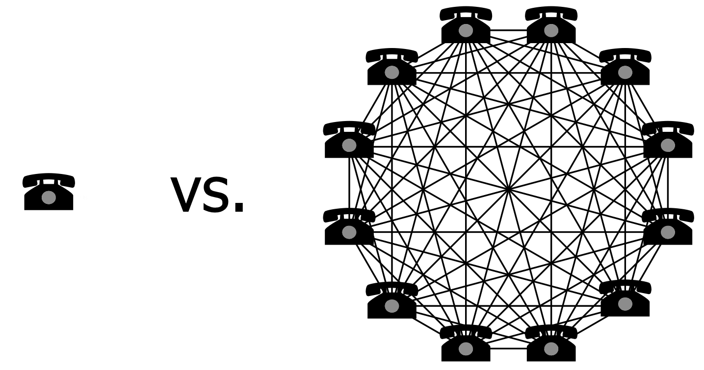
e.g., network effect/Metcalfe’s law: one phone in the world is useless; its value increases, the more phones there are
_________ input (ideal value/ goal state) |
__________ (actual - reference) |
______ system |
||
disturbance (from outside the system) |
sensor (detect input) |
|||
input (values related to goal state) |
output (results of system actions) |
e.g., HVAC (heating/ventilation/air conditioning) system:
- is a closed loop
- applies negative feedback
Norman (1988/2013):
Note: A given constraint may fall into more than one category.
• ________: actions limited by shape or size
- depends on affordances and signifiers
- closely related to real affordances
e.g., you can’t fit a ______ in a toaster
• _______: use reasoning to determine proper action
- based on organized, principled relationship between components of a system
- most important component of a good conceptual model
e.g., assembling ____ toy--with one piece left
• ________: restricts choices based on meaning of situation
- requires prior knowledge of the context
e.g., positions of _____ pieces at start of the game
• ________: learned conventions/behaviours shared by a cultural group
- based on social norms, traditions, rituals
- choice of action may be arbitrary
e.g., Chinese wedding invitations are ___
Kline & Beitel (1994):
Problem: to design useful signs to indicate action for door
• _____ (language-limited?)
• pictures (ambiguous?)
• ____ (longer processing?)
Stages of action:
1. see sign/signal, 2. identify/understand it, 3. comply with it
I. Lab Study
Stimuli:
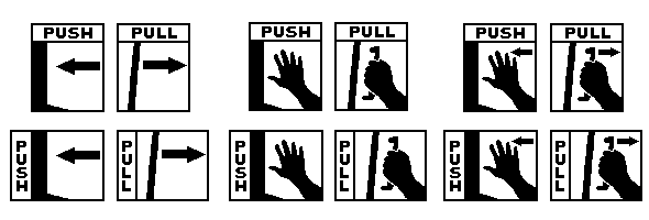
- signs developed via __________ method: intended users draw potential signs
- 11 stimuli for each push/pull pair: 3 symbol only, 2 word only, 6 mixed modality (symbol/word combos):

Procedure:
- identification RT
- ___________: sign present vs. absent RT
1) present target sign, 2) present 8 signs
Was target present in display 2?
- __________ & meaningfulness rankings
Results:
- identification task: fastest RTs for mixed-modality signs
- conspicuity task: fastest RTs for word-only signs
- ______-____ signs not preferred, less meaningful, generally slower
II. Field study
Procedure:
- signs placed at average (male) eye-level on doors at a U of Calgary library
- doors could be opened by pushing or pulling (baseline: 42% pushed, 58% pulled)
- observations made with no external cues (no models; door not still swinging)
Results:
- signs did affect behaviour
- greater compliance with mixed-modality (87%) and word-only (84%) than symbol-only (66%) signs
Lab vs. Field Research
- meaningfulness ranking correlated with compliance: r = .83
- efficiency index calculated across all dependent measures (lower is better):
• best: handhand + horizontal word (3.67)
• next: hand + arrow + horizontal word (4.17)
• worst: all symbol-only (7.50 to 8.33)
Conclusions
- best signs have little _____-___: words (speed) and symbols (universality)
- extra stimuli does not always hinder acquisition of relevant information
- lab findings were _________ from field data--both should be considered
(semiotics: the study of signs and symbols; their use, interpretation, and meaning)
Rogers (1989): user interface icons
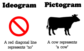
- images include ideograms (symbols that represent ideas) and pictograms (pictorial representation of a thing)
- greater meaningfulness of icons enhances recall and recognition/identification performance
- affected by
• __________ concept: influences ease of mappings from referent to meaningful graphical images
e.g., documents, files, folders have physical counterparts
e.g., danger, hazard, safety, warning do not
• ________: type of task determines meaningfulness of icons
▸ if verbal information required, use text--not icons
▸ images may be more useful if user is less sure of information wanted
• ______ form: icons differ in the way they signify the underlying concept
▸ ________________ icon directly portrays the underlying referent, or depicts a typical example (or most representative characteristic) of a general class of objects:


▸ ________ icon conveys underlying meaning more abstract than its image:

▸ _________ icon has no relation to underlying referent; meaning must be learned:

• _______: limits and directs possible interpretations
e.g., traffic signs on a road vs. in the library?
e.g., a triangle may mean a mountain (resemblance or exemplar), a hierarchy (symbolic), or danger (arbitrary)


Mortimer (1993; 1999):
- HMBL (a.k.a. Center High Mounted Stop Lamp, a.k.a. “Dole light”) required on passenger cars since model year 1986, light trucks since model year 1994
- ostensibly reduced rear-end collisions by ~50%
- HMBL criteria:
• ____-mounted
• red, 4.5 in.2, 40-160 cd
• ________, distinct (located at centreline)
• redundant with other brake lights
• visible _______ vehicle ahead of you
- HMBL problems:
• ___-mounted lamps work equally well (HMBL closer to point of eye fixation--but regular brake lamps also visible in periphery)
• detectability: difficult to see _______ vehicles ahead of you (even when visible, braking behaviour not affected)
• HMBL did not decrease braking RT
What about the 50% decline in collisions?
- weak link between lab and real world
- in tests, HMBL was _____ → more salient
- as HMBL become more ______, its shortcomings as a safety device become more apparent
• 1986: 22% reduction (Kahane, 1987)
• 1987: 17% reduction (Kahane, 1989)
• Theeuwes (1991) removed novelty effects: 3.5% reduction in collisions
• NHTSA (1998):
- long-term effectiveness: 4.3%
- ____ = US$206 million
- medical/property damage _______ = US$655 million
Transport Canada (1994):
- daytime running lights (DRLs) mandatory starting with the 1989 model year
- head-on & turning collisions reduced:
• ___% in daylight
• ____% at twilight
Angiolillo & Roberts (1991): What makes a manual look easy to use?
- a manual is required if a system is complex (or if design is poor)
- if the manual _____ difficult, people won’t even try to use it
- procedures:
• 6 manuals compared
• relative preferences measured on 19 “dimensions”
- results: the following are important
• ____________
• table of contents: desired whitespace, not crowded
• ease of _______ information: tabs, section headings
• section titles: distinctiveness is desirable
(e.g., type size/font, indents)
• colour, figures, examples: the more the better
- conclusions:
• in general, different ease-of-use ratings were found for manuals identical in _______
• more organization and visual appeal (colour, pictures, etc.) is good
• margins (whitespace?) and typeface not as important (as long as it’s not ridiculous, like Comic Sans)
• certain features may be found in manuals perceived to be easy to use, but what about ______ ease of use?
Song & Schwarz (2008):
Study 1:
- presented ________ instructions identical in content in either a) Arial or b) Brush Script typefaces
- asked participants about the exercise regimen
- a) were more open to exercising; believed it would take less time, and would feel more fluid and easier
Study 2:
- presented recipe for making a Japanese _____ ____ in either a) Arial or b) Mistral typefaces
- asked participants about the recipe
- a) were less likely to see the recipe as time-consuming and requiring a high level of culinary skill; more apt to try it themselves
Conclusion:
- we perceive things to be more appealing, easier to handle and more efficient, based on how easy they are to understand: processing _______
- this is also heavily influenced by surface features, such as the font of instructions
Mayer (2002): Why won’t we read the manual?
- automakers are required by ___ to provide an owner’s manual
- about 20% of issues handled by Subaru customer service are about something covered in the (450-page) owner’s manual
- Subaru’s manual is now supplemented with an 8-panel folder, with answers to frequently asked questions, that fits behind the visor
- as the number of functions performed by devices has increased, manuals have increased in complexity and length--and reading of manuals has _________
- Whirlpool puts stickers with directions on their appliances, and gives customers videos
- Whirlpool’s goal is to design a product that doesn’t require specialized instructions or instruction manuals
- How? By making appliances ___________:
e.g., some microwave ovens allow you to specify what you are cooking--they then automatically calculate cooking time and method
- this approach __________ knowledge and information
- also seen in natural mappings; need no extra reminders or labels; require no extra memory demand or interpretations of signs