[ Previous |
Next |
Contents |
Glossary |
Home |
Search ]
Motif and CDE 2.1 Style Guide Reference
Icon
Reference
Description
An icon is a pictorial representation of an object that can be manipulated
directly. An icon typically consists of an image and a label. The image might
be text, a frame from a video object, or a graphic representation of a printer
or document, and may include animation. Icons for the same object may be
displayed in various sizes. The operating environment and the container for a
collection of icons may support distinct small, medium, and large icons that
represent the same object but differ in detail and size.
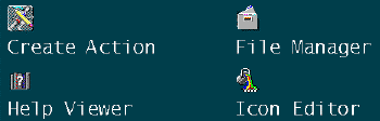
Figure 32. Window and Application Icons
When to Use
- Required
- Use an icon to represent objects that the user can place in a container.
- Recommended
- Do not use an icon to represent a function. Place function choices on
menus and in push buttons or tools.
- Recommended
- Use large icons only for window icons.
Guidelines
- Required
- Define an icon to consist of an image and an optional textual label as
follows:
- Image
- Use a common, task-related symbol associated with the object it
represents.
- Label
- If you provide a label, place the label below the image. If the
image is small relative to the size of the label, place the label to
the right of the image. For information on bidirectional and vertical
language support, see Chapter 11.
- Required
- Ensure that the image has a border that prevents the image and the
background from merging.
- Recommended
- Use a readily identifiable shape or outline for the icon. This helps to
improve user recognition and reduce a user's dependence on other
identifiers such as the label or color. For example, an icon of a printer
clearly identifies its purpose; the label can be reduced to a brief identifier
for the specific printer.
- Recommended
- Design an icon so that it shows the important states associated with the
object it represents. Such states might include:
- The object needs attention, for example, the printer is out of
paper.
- Some threshold has been reached, for example, a mailbox is full.
- The object can only be read, for example, the user does not have
the authority to modify a document.
- Recommended
- Design an icon so that it shows the important characteristics associated
with the object it represents. Such characteristics might include:
- The security classification of an object, for example, a document
is confidential or of restricted distribution.
- The urgency of some task associated with the object, for example,
an electronic mail item that must be responded to immediately.
- The size of the object, for example, the number of mail messages
in a mail container.
- Recommended
- If you show shadows on objects to add depth to the image, assume the light
source is from the front top-left and place the shadows to the right, below
and behind the object.
- Recommended
- When several elements or objects are used together within one icon image,
visually unite them. For example, overlap the elements to present a more
visually unified whole.
- Recommended
- If your application will be presented in more than one language, avoid
using words, body parts, or figures that involve signing with hands or fingers
in the icons.
- Required
- Limit the detail in a small icon to avoid a cluttered appearance. For
example, do not display a count of the number of objects in the container.
- Recommended
- Do not use an algorithmically reduced copy of the original icon as a small
icon. Instead, use a separate graphic to display a small icon that shows fewer
characteristics so that the characteristics can be more easily distinguished.
- Recommended
- Use a small icon to represent the general type of an object when space is
limited.
- Recommended
- Allow a user to customize the image of an icon that represents an object.
For example, allow a user to change the icon to make it more meaningful,
recognizable, or personal.
- Recommended
- Use colors in an icon to enhance user recognition and to intentionally
link or group related elements. To avoid a busy, cluttered screen and to
reduce the chance of unintentionally indicating a relationship between
objects, do not overuse different colors.
- Recommended
- If you use colors in icons, also provide a separate set of icons that can
be used on gray scale or monochrome displays.
- Required
- If an icon represents a named object, label the icon with the name of the
object.
- Required
- If direct editing can be used to change the textual label of an icon,
include a Properties choice in the icon's pop-up menu, and include a
text-entry field in the properties window through which the label can be
changed.
- Recommended
- Support direct editing to allow mouse users to change the textual label of
an icon.
- Recommended
- Visually separate the textual label from the icon image.
- Recommended
- When the icon has focus, expand the width of the label to display the
entire text. For example, when the icon for the "1999 Financial Goals"
document has focus, display the entire document name as the icon label.
Supplemental Related Topics
For more information, see the Label, Object, and Text-Entry Field
(Control) reference pages.
[ Previous |
Next |
Contents |
Glossary |
Home |
Search ]