The following controls present and organize actions:
A push button is a control that displays a label or graphic that represents an action. When the user activates a push button, that action executes immediately.
You should use a push button when you want an action to occur quickly and easily.
Examples of push buttons include:
For more information, see the Push Button (Control) and Push Button (Predefined) reference pages.
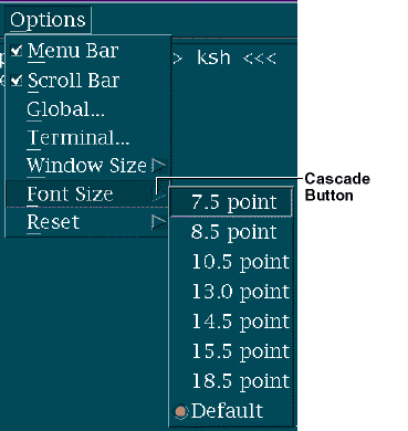
A menu cascade button is a control that represents cascading
choices from which the user can display a pull-down menu..
View figure.
For more information, see the Menu Cascade Button (Control) reference page.
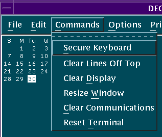
A menu bar appears across the top of a window, just below the title bar. It contains a horizontal list of cascading choices called menu-bar items. When the user chooses a menu-bar item, an associated pull-down menu appears.
The name of each menu-bar item indicates choices on the associated pull-down menu. For example, the associated pull-down menu for the Help menu-bar item could have the following choices:
For more information, see the Menu Bar (Menu Type) reference page.
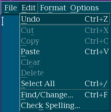
A pull-down menu appears when a user chooses a menu-bar
item, window menu button, or a menu cascade button..
View figure.
For more information, see the Cascading (Choice Type) and Pull-Down Menu (Menu Type) reference pages.
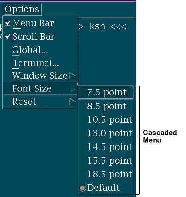
A cascaded menu appears next to, and contains choices related to, a cascading choice in another menu. It is not visible until the user makes a cascading choice. A cascaded menu contains choices that modify or are related to the cascading choice.
Cascaded menus allow you to layer choices so that the user can have access
to a wide range of functions without using long pull-down or pop-up menus..
View figure.
For more information, see the Cascading (Choice Type) reference page.
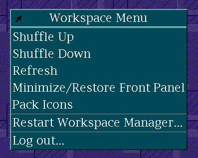
A pop-up menu provides choices specific to an element. A pop-up menu is not visible until the user invokes it. Only choices that are currently valid appear in a pop-up menu.
Pop-up menus provide the user with convenient access to menus. The user
does not need to move the mouse pointer to the menu bar nor does the user see
unavailable choices..
View figure.
For more information, see the Pop-Up Menu (Menu Type) reference page.
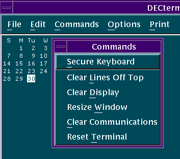
A tear-off menu is a copy of a pull-down, pop-up, or cascaded menu that the user has "torn off" and placed in a separate window. The tear-off menu always contains the same choices as the original menu, with the exception of the tear-off choice.
For example, the user can "tear off" a frequently used menu and
position it in a convenient place on the screen..
View figure.
.
View figure.
For more information, see the Tear-Off Menu (Menu Type) reference page.
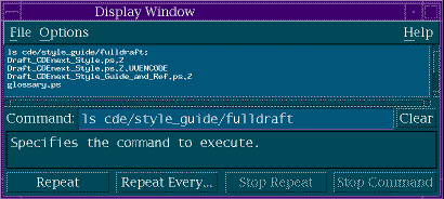
A command box allows the user to review previous commands
and to either choose to reissue a previous command or to issue a new command..
View figure.
For more information, see the Command Box (Control) reference page.